
For a while now, I’ve been mulling over how to tell if interfaces are overloaded in a good automated way. Staring at 1000 interface utilization graphs is not efficient. How do I know which ones are worth looking at? Perhaps some sort of Top N calculation, where a tool identifies the top N worst interfaces (for some form of “worst”), and then I or someone looks at the utilization graph for the last day or week – manageable and informative for N < 20 or so.
The concern here is that most network management tools report averages over some period of time. Averages tend to smooth out peaks, which in networking represent periods of possible congestion. If I have an interface running at near 100% for 8 hours, when you average that over 24 hours, the average is 30%. How do I tell the difference between an interface that was saturated for 8 hours then no load, from one which was running steadily at 30% over all 24 hours, for example? Since the latter condition is rare, top N on utilization percent is a good starting point. Can we do better?
Business hours awareness in tools is one answer (perhaps complex if global). If we have a U.S. centric organization, perhaps focusing on 8 AM to 5 PM Eastern time is a somewhat workable starting point.
How to weed out things like overnight replication is another topic. Knowing which links are busy doing overnight (or full-time) database replication when using some form of busy-link reporting is a starting point. Ok, that’s a bit of a special case.
Doing Better
Sites using tools with threshold alerting might be one way to get to the data I’m looking for. Two years ago, I worked with a site doing CA E-Health (yes, very costly and old). They got a lot of “interface exceeded 90% for 20 of the last 60 minutes” messages. That and a useful CA E-Health graphic that I hadn’t seen in a while got me thinking.
The graphic in question showed stacked bars for each interface, red = badly congested, orange = moderately congested, and green. Each color in one vertical stacked bar represented the fraction of 24 hours spent at that utilization level. So, lots of red meant that interface was congested most of the time.
If the 90% threshold alerts, say from another tool, go into Splunk, why not count them and report? If you can also set up say 70% threshold alerts and count them, then you’ve got pretty much what E-Health was doing.
The takeaway: if you count “bad periods”, being 1, 5, or 15-minute averages where the utilization is over say 90%, then the interfaces with the biggest counts are the ones with the most congested periods during the day.
That strikes me as an interesting statistic, albeit one not found in most network management tools, where I might have to “roll my own” report. (Fun with API’s?)
Since most sites I’ve been at recently don’t have tools that do thresholding and send (syslog?) alerts, this approach has challenges. There is also my lack of desire to re-invent something that network management tools should already be doing.
Opinion: Our management tools have got to mature from showing raw info into showing scalably actionable info, especially as IOT comes online. Much faster rate of innovation, please? Probably rate limited by available fuel, i.e. $$$.
Another Approach
I ran into Terry Slattery in our office a few days ago and we got to talking about this. He is a fan of the 95th percentile. I had been somewhat aware of what he’s posted on the topic (see References below), but it hadn’t quite seemed to solve my problem.
Loosely put, the 95th percentile is the data point you get when you sort the data and find which data point is approximately 95% up from the bottom. Terry’s shared insight is that if you have per-minute interface data (yes, classic SNMP, or telemetry), then you have 1440 data points (24 x 60) in a day, so the 95th %-ile is 72 (5%) down from the top one in the sorted list. But the way to think about that is the utilization (or errors, discards, etc.) number where the link was worse than that for roughly 1 hour (rounding 72 minutes to 60).
I quibbled about whether 1 hour was the right duration.
My answer: If you want to know about interfaces, which were rather busy for 3 hours, then you need roughly the 85th percentile data (every 5% subtracted from 100% corresponds to another 72 minutes).
So, network management tool vendors, what I think I want is Top N reporting (for variable N) of the X percentile, where X is user-selectable, applied across all or selected interfaces, for in and out directions, for errors, discards, and utilization percentage.
That ought to be fairly quick coding (I’ve done it in the past, when I added all kinds of statistical functions to a spreadsheet product). It’s basically a sort and index operation if you go at it in the most obvious way.
Thought: I seem to recall that there may be more efficient ways to approximate a given percentile, which would be good enough. Confirmed by Googling “efficient compute percentile”. Details left as exercise for the reader.
Trying It Out
If you want to check this out for one interface, maybe using data on your Internet interface: export your data to Excel and put the data into one column.
The percentile() function will then find the chosen percentile: “=percentile(range,0.95)” for example, where <range> is the cells containing the data.
Bonus points: Graph the data and figure out a way to draw a horizontal line at the 95th %-ile.
I did this with some random data (720 data points). The result:
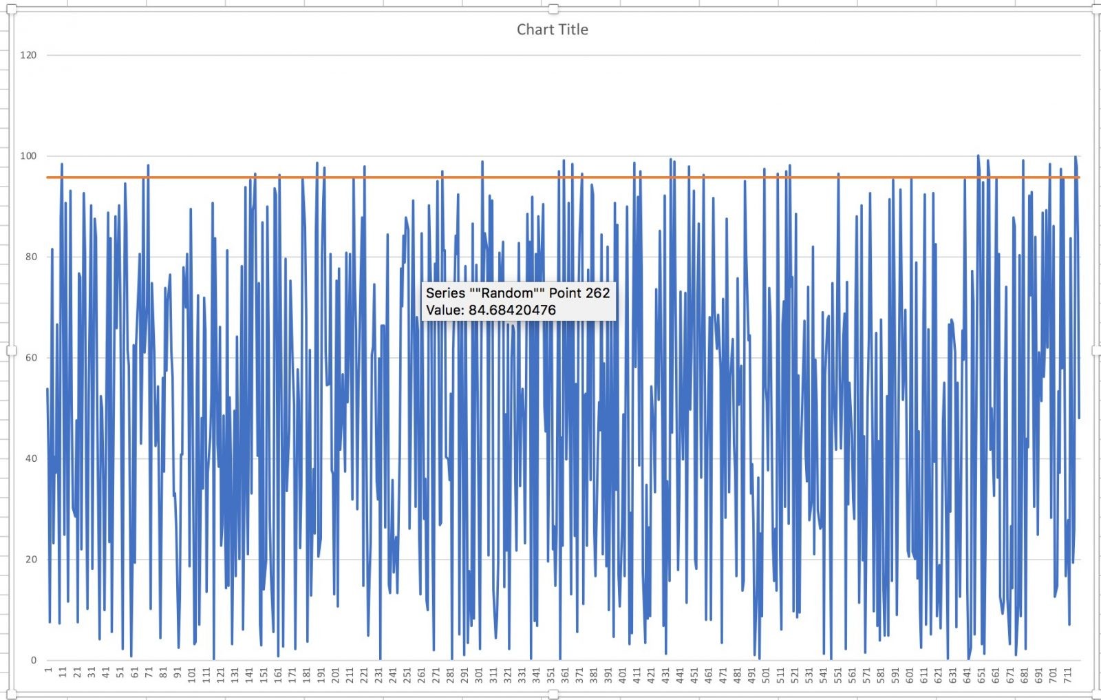
It should not be a surprise that with uniformly random values from 0 to 100 the 95th percentile is around 95. Since I used 720 values, 5% or 36 of them should stick up above the red line.
Final Comments
How do YOU (or your favorite tool) solve this problem of automatically identifying candidate worst interfaces? I’d be interested in hearing – please comment this blog or email me!
References
Terry Slattery’s blogs about the 95th percentile:
Comments
Comments are welcome, both in agreement or constructive disagreement about the above. I enjoy hearing from readers and carrying on deeper discussion via comments. Thanks in advance!
—————-
Twitter: @pjwelcher

NetCraftsmen Services
Did you know that NetCraftsmen does network /datacenter / security / collaboration design / design review? Or that we have deep UC&C experts on staff, including @ucguerilla? For more information, contact us at [email protected]”.